Our Projects
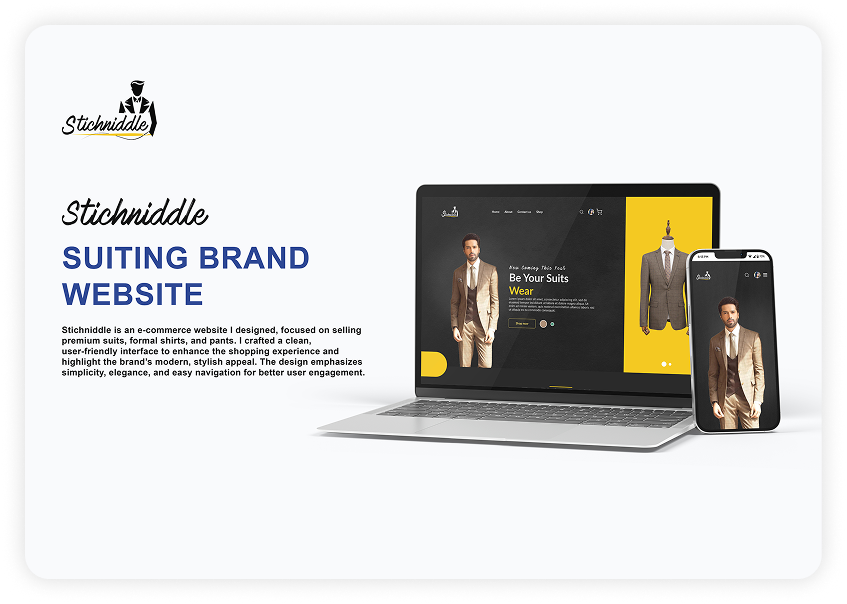
Stichniddle
Stichniddle
SUITING BRAND WEBSITE
Stichniddle is an e-commerce website I designed, focused on selling custom suits and tailored fashion. With a sleek design inspired and tailored for luxury modern, public sector. The idea of standardization and way designers and easy navigation for consumers.
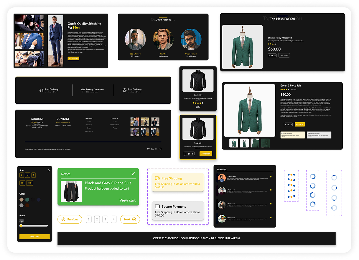
Stichniddle Components
Stichniddle components help designers and developers to develop their designs quickly.
1. Web & App Components
- Hero sections
- About us card
- Bottom Nav Bar
- Filters
- Notifications
- Product cards
- Reviews
- Listings
- Pagination
- Taglists
- Company/Brand cards
- Information cards
- Sign in & Sign up
- Forms
- String/detail inputs
- Testimonials
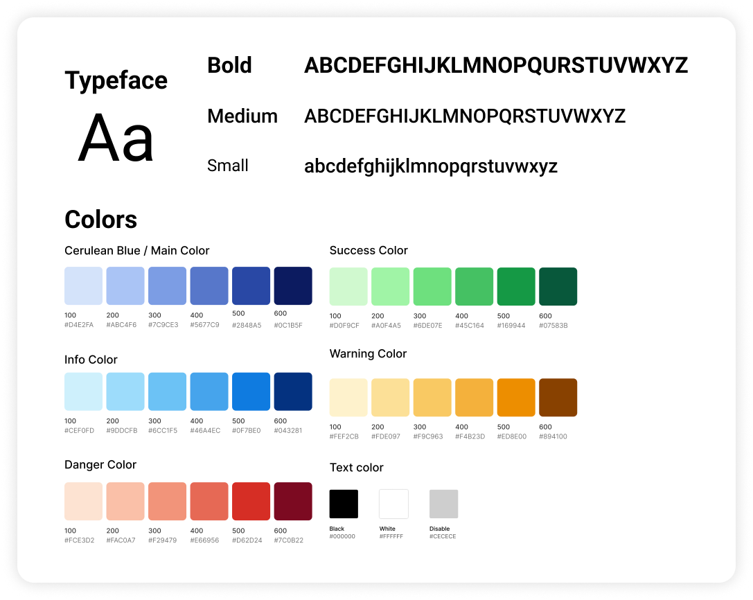
Stichniddle Style Guide
The balance between aesthetically please visuals & usable products is the perfect place to be. Networker is designed with a modern, sans-serif typeface with clear weight variations to ensure readability and hierarchy.
Typeface
The design utilizes a modern, sans-serif typeface with clear weight variations to ensure readability and hierarchy.
- Bold: Strong and impactful, used for headings and emphasis.
- Medium: Used for subheadings and secondary content.
- Small: Clean and minimal, ideal for body text and captions.
Color Palette
The color system is designed to be both vibrant and functional, supporting a wide range of use cases from UI elements to data visualization.
- Main / Cerulean Blue: A calm and trustworthy tone, perfect for primary branding and interactive elements (#0A74DA).
- Success Green: Represents growth and positive outcomes, from light #0DBFBF to rich #0F9B3B.
- Info Blue: Clear and communicative, supporting alerts and callouts, from #CEF0FD to #2AB3FC.
- Warning Yellow: Warm and cautionary, with hues ranging from subtle #FFF2CB to strong #FFBA00.
- Danger Red: Commands attention and signals critical actions, from gentle #FE2302 to #D80027.
- Text Colors: Includes standard black (#000000), white (#FFFFFF), and a disabled state gray (#CECECE) for accessibility.