Our Projects
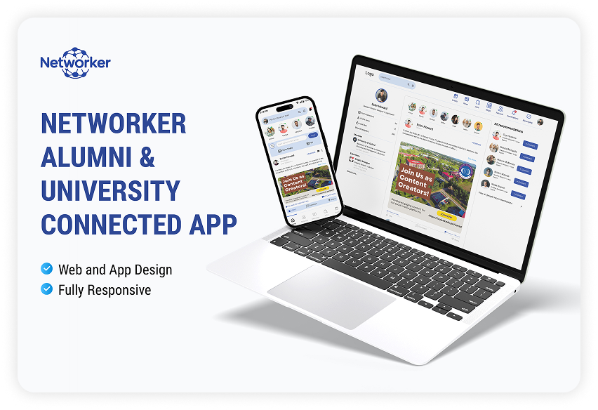
Networker
Networker
The AMS is expected to be a comprehensive and user-friendly platform designed to address the specific challenges and needs of the university and its alumni community and foster a connected engaged, supportive life-long relationship.
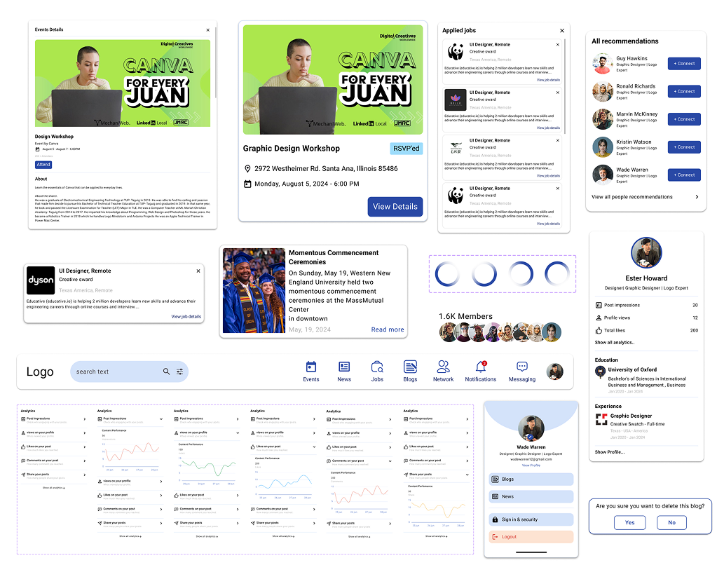
Networker Components
Networker components help designers and developers to develop their designs quickly.
1. Web and App Components
- News Cards Components
- Event Components
- Analytics Components
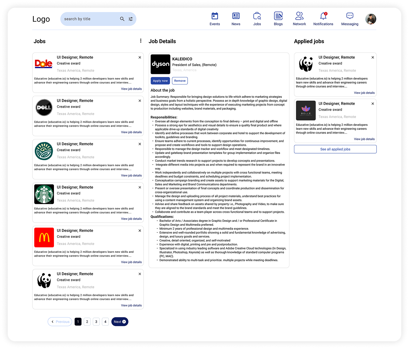
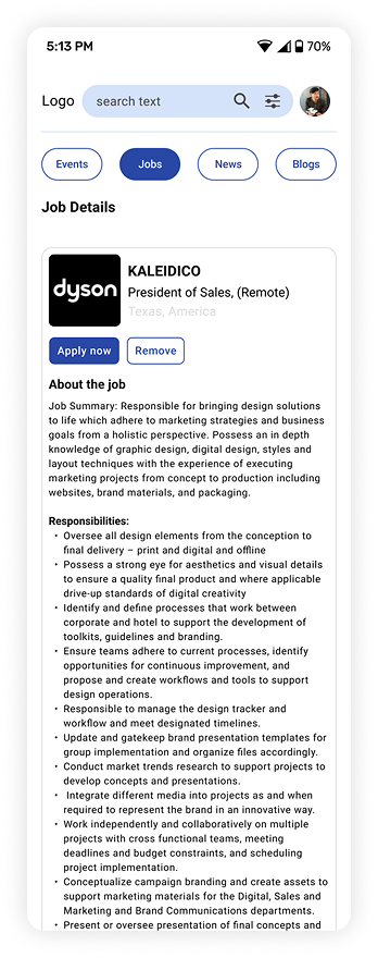
- Job Card Component
- Recommendation Card Component
- Top Nav Bar Component
- Profile Menu Component
- Confirmation Card Component
- Loading Component
- Experience Card Component
- Member Card Component
- Sign and Security Card Component
- Post Create Card Component
- Poll Component
- Profile Data Card Components
- Pagination Component
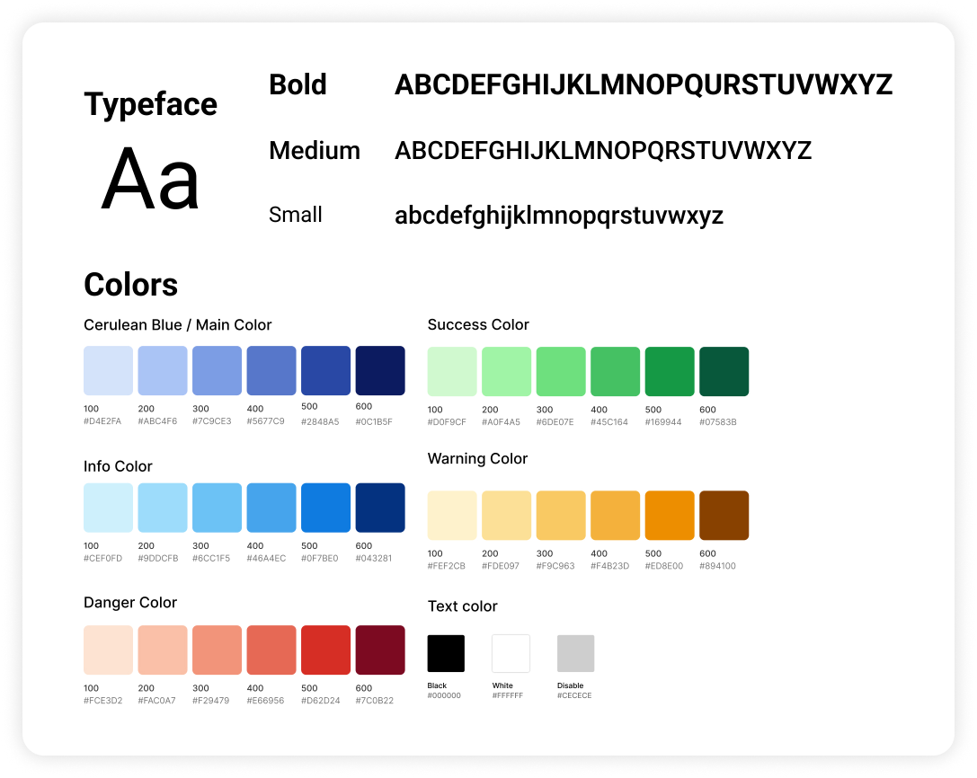
Networker Style Guide
The balance between aesthetically please visuals & usable products is the perfect place to be. Networker is designed with a modern, sans-serif typeface with clear weight variations to ensure readability and hierarchy.
Typeface
The design utilizes a modern, sans-serif typeface with clear weight variations to ensure readability and hierarchy.
- Bold: Strong and impactful, used for headings and emphasis.
- Medium: Used for subheadings and secondary content.
- Small: Clean and minimal, ideal for body text and captions.
Color Palette
The color system is designed to be both vibrant and functional, supporting a wide range of use cases from UI elements to data visualization.
- Main / Cerulean Blue: A calm and trustworthy tone, perfect for primary branding and interactive elements (#0A74DA).
- Success Green: Represents growth and positive outcomes, from light #0DBFBF to rich #0F9B3B.
- Info Blue: Clear and communicative, supporting alerts and callouts, from #CEF0FD to #2AB3FC.
- Warning Yellow: Warm and cautionary, with hues ranging from subtle #FFF2CB to strong #FFBA00.
- Danger Red: Commands attention and signals critical actions, from gentle #FE2302 to #D80027.
- Text Colors: Includes standard black (#000000), white (#FFFFFF), and a disabled state gray (#CECECE) for accessibility.
Visual Design
Some of the Screens of Networker
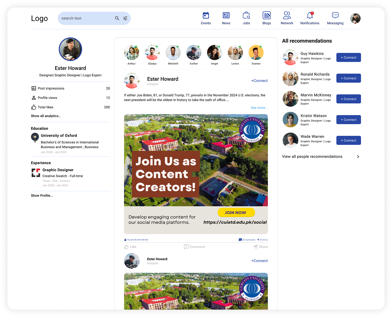
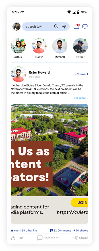
Home Screen
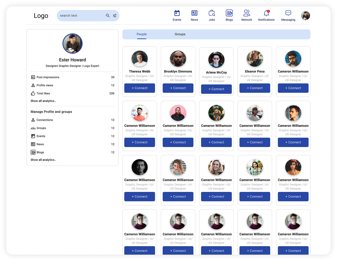
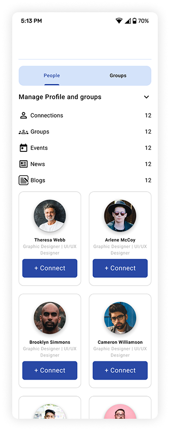
Alumni or Student Network
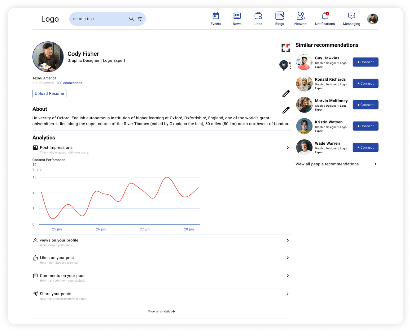
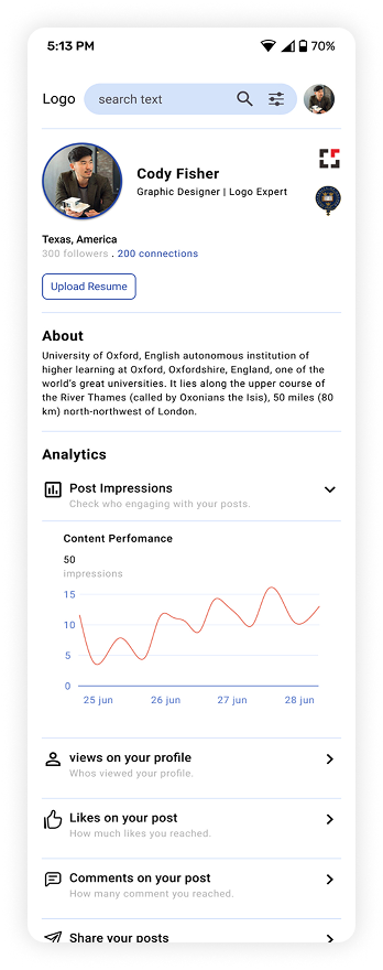
Alumni or Student Profile
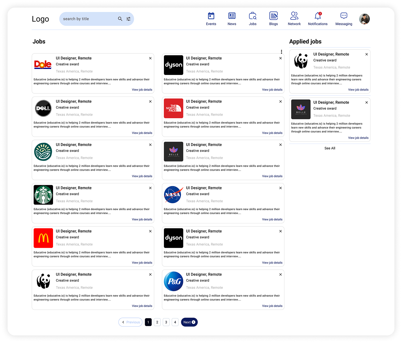
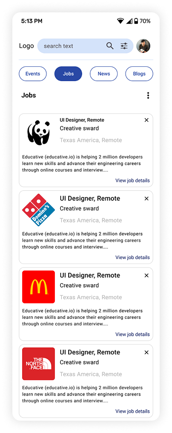
All Jobs